THE BAD: Comic Sans
You probably shouldn’t be too surprised seeing Comic Sans on this list. Before we get to the negative side, let’s get the positives out of the way. Yes, it’s a free and casual style font that isn’t meant to be taken seriously. Yes, it is also one of the few fonts approved for use for Dyslexics by the British Dyslexia Association (BDA). That’s great until suddenly everyone decides to use it for everything. Yup – even the police. Comic sans is undoubtedly the most infamous font out of them all. One of the reasons why many people seem to find it weird or unpleasant is because it falls right into the uncanny valley. It comes really close to what a person’s handwriting could look like, yet it’s obviously not real. The childish and playful appearance of the font also plays a huge role here. Websites like comicsanscriminal.com and bancomicsans.com explain this very well. Believe it or not, there are also lots of other fonts that are suitable for dyslexics that actually look nice, clean and professional. For me, this means that big companies like Starbucks really have no excuse for using the font whatsoever. The bottom line? Yes, it’s okay to use Comic Sans in actual comic strips, in works meant for young children and when presenting information to a group of dyslexics. But please, PLEASE don’t use it on official documents, serious presentations, signs, posters, album art, signatures etc.
THE GOOD: Digital Strip
If you think Comic Sans is unsuitable even for it’s main purpose, comics, here’s an alternative. A proper and good looking font for making comics. Nice, punchy and contently playful. Although comic sans is okay to use for comic books there’s still a likelihood of over-analytic designers to spot the font and burn down your comic book studio. You never know – better safe than sorry! On the serious side – Digital Strip looks like the slightly more mature brother of Comic Sans. It keeps the rounded edges of each letter and retains a nice and bold look. It feels kind of like the font used in Marvel comic books, except it’s a bit thicker. So there you go – if you want or need to put Captain America in your next design piece this is the font. Download Digital Strip
THE (kind of) BAD: Times New Roman
Okay, let’s get this straight – Times New Roman is not a bad font. It’s just a font you’d expect to see in a word document, not in an art/design piece. So what’s wrong with it? Nothing -it’s a good font. But why use a good font when you can use a great font? Aside from newspapers, there are lots of amazing serif fonts out there that look better, save space and printer ink and help you steer the overall look into either classic or classy. Use Times New Roman for long paragraphs of text, official documents, books and… roman lettering. Avoid using it for short paragraphs, titles, and anything that’s supposed to look modern. For a more modern look try picking a font without serifs.
THE GOOD: Baskerville Old Face
See what I mean? The letter contrast in Baskerville Old Face is higher compared to that of Times New Roman. See how the letter “O” is really thin vertically and very thick horizontally? This makes the writing appear a bit fancier and a lot more pretentious. While Baskerville is more or less unsuitable for books or longer paragraphs of text, it’s perfect for titles and short text excerpts like quotes. Baskerville Old Face comes installed on most versions of Windows, but if you don’t have it you can always grab it from the web. Download Baskerville Old Face
THE VERY BAD AWFUL: Algerian
Oh, Algerian! I loathe you so! The following sentence pretty much describes everything about Algerian: If you own a business and this font is part of your logo, promotion materials, documents or anything, really, you should already feel ashamed of yourself. No, the font doesn’t take me to the distant Victorian era, nor does it make me feel “retro” in any kind of way. It’s just an ugly font. I’m sorry. We live in the 21st century and now’s not the time for a font that was originally designed in 1988. What infuriates me the most is when amateur designers use this font as their primary thick title font. So here is my appeal to any designers who might be reading this right now – If anyone, even an antique shop owner asks you to use this font for a design you should politely refuse. There are tons of other alternatives out there – don’t restrict yourself to the overused font library that comes bundled with Windows.
THE GOOD: Bebas Neue
If you need a thick looking attention-grabbing font that is suitable for titles, consider using Bebas Neue. It screams “modern”, but doesn’t look as generic as Impact. This can easily become your go-to font whenever you’re not sure what to use. The font is narrow and tall, which makes it perfect for titles (it saves space, too!), quotes, emphasis, shortlists, minimal web design. Avoid it for long paragraphs and anything non-primary. Download Bebas Neue
THE BAD: Colona MT
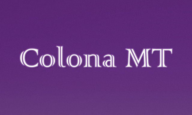
Here’s another font you wouldn’t have heard of or seen if it wasn’t bundled with Windows. It’s not as widely used as Comic Sans or Algerian, but in my opinion, it shouldn’t really be used for anything at all. The letter split in the middle of this font is plain awful – I can’t stand looking at it for more than a few seconds. At the same time, the font seems unfinished. It’s neither quirky nor serious. It’s the kind of font that an amateur designer would use to try and represent something different and, supposedly, more “unique”. When I recognized this font as part of the main logo of a local security company I wasn’t sure whether I should laugh or cry. The font was everywhere – as a neon sign, on the guards’ uniforms, as car vinyl and it was even used as a paragraph font for some of their older flyers – yet another case of brand identity gone awfully wrong. I’m not exactly sure what kind of a weird taste for aesthetics one needs to have in order to like this font, so I’ll just skip ahead and try to automatically assume you’ve already deleted this font form your computer.
THE GOOD: Glasten
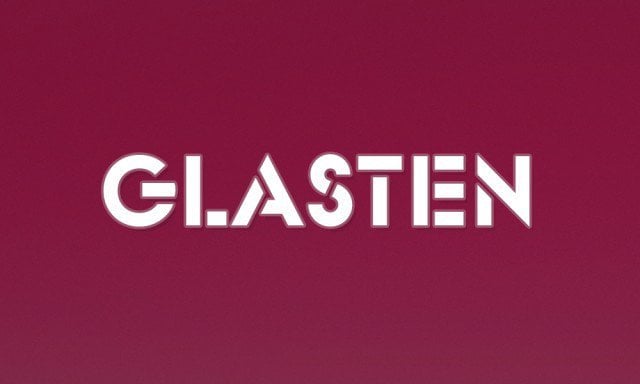
If you want something quirky, Glasten is a perfect choice. It’s not too crazy, but it’s crazy enough to make a difference. Its weight makes it easy to read and, unlike Colona MT, the letter cutoffs aren’t distracting and intrusive. This non-serif font is a good choice for titles and logos, mostly ones related to technology (if you rotate the “G” 90 degrees counterclockwise it looks like a power button). It’s not a font that can withstand heavy use, but it can really make a difference if used correctly. Download Glasten
THE BAD: Papyrus
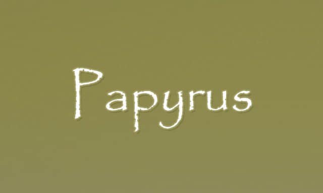
Papyrus features an ancient paper-like texture thanks to the small holes in the letters. It’s a rather weirdly spaced out font, which can make it a little more difficult to read for extended periods of time. It appears to be a handwritten font, as the name suggests, but it’s not meant to be fancy or pretentious. Realistically speaking, Papyrus isn’t that awful. It just has a history of awfully inappropriate uses. The logo of James Cameron’s “Avatar”, for instance, is written in Papyrus and has no visual changes/improvements whatsoever. The subtitles in the movie were also written in the font, which caused a massive twitter outrage, to say the least. Who knows how much that graphic designer got paid anyway… This font is still frequently used in book cover designs, logo designs, and even posters. While the grungy effect of the letters is somewhat okay, a smarter approach would be to pick a better looking and better spaced out the handwritten font and just apply a texture over it. As simple as that.
THE BETTER: Georgia Italic
I don’t like fancy handwritten fonts that are hard to read. I also don’t like wannabe handwritten fonts like Papyrus. But I do like italic serif fonts that have that extra twist to them. George Italic is just one of the many fonts that fall into this category, but one of the few that come bundled with Windows. There’s really not much to talk about here, but my general point is – maybe if they used this font as the subtitles for Avatar people weren’t going to be so mad? Download Georgia Italic
At the end of this article, I’d like to turn to every amateur graphic designer or hobbyist. Yes, it’s okay if you’ve used one of the “bad” fonts before. If you’re an amateur graphic designer you shouldn’t feel ashamed if you’ve used one of these fonts before – we all have. We all start somewhere. People learn from their mistakes. What’s important is that you keep moving and learning from your mistakes. Graphic design isn’t all about typography anyway, so don’t let a few bad font decisions put you down! Oh, and if you’re just a hobbyist who accidentally used Comic Sans or Algerian on your friend’s birthday card – don’t feel ashamed. As a graphic designer myself, I’ve received lots of poorly made birthday cards – it’s not a rarity. At the end, when it doesn’t come to professional work, it’s the thought that matters. Comment Name * Email *
Δ Save my name and email and send me emails as new comments are made to this post.
![]()
